Tuesday, December 21, 2010

Christmas Sketchbook

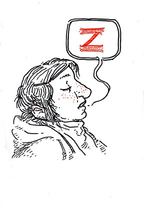
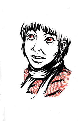
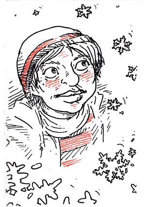
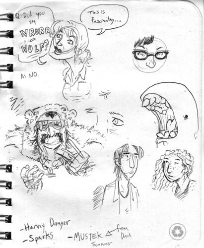
I started a new sketchbook recently, and decided to use it as an opportunity to try out a couple of new pens. Also to draw people wearing winter clothes.

Christmas Sketchbook 01

Christmas Sketchbook 04

Christmas Sketchbook 06

Christmas Sketchbook 07

There're a few more over on my flickr as well.

Thursday, December 9, 2010

Thoughts On Color

So you know what I've been really into lately? Color!

Paw Prints Sample 3

I feel that in the past, coloring drawings has mostly been more of an obligation for me than something I generally enjoyed. I mean, don't get me wrong, I do like when things are in color, and coloring has never been a huge chore or anything. I've even often been fairly happy with the end results. But until recently I've never really gotten into the act of coloring a drawing the same way I've gotten into the act of drawing it. And now that's started to change.


There are probably multiple factors that contribute to this shift, but I feel like one of the big ones is the fact that I've been getting really into Dave Stewart's coloring on BPRD. In the past, when coloring something, I've known that you probably want to have a baseline color for the object, and a darker shade of that same color for the underside and the parts that might be covered in shadow. Stewart takes this a couple steps further though. It's not a matter of just base color and shade - he'll often have a base color, a shade, a darker shade, and a separate shade for the light reflecting off of it. On average there is always at least three different levels of shades to an object at a given time! And this is different then using a gradient or anything like that too. Each level of shading constitutes a solid object unto itself. This is shading in layers! And it looks awesome!


Yes, I realize this is pretty much just an interesting shading technique. But it strikes me as embodying an approach to coloring that makes a lot of sense to me. It's like sculpting with color! Coloring by degrees. And it makes the whole coloring process a much more deliberate affair. I think the reason I haven't enjoyed coloring as much in the past is because all I've been doing is putting color on the drawings - which themselves are already completed. I haven't been sufficiently involved. With this approach, however, it's not just adding color, it's adding something to the drawing itself! You're adding further depth to it (both figuratively and literally). And the act of coloring thus becomes something closer to a continuation of the act of drawing, not just flatly coloring it in, but giving further life to it!

Anyway, I'm not sure if that fully makes sense or is exciting to anyone else. Maybe I'm just pointing out something super obvious, that I'd somehow never noticed before. But still it's exciting for me. And it makes me actually want to color things more. So I figure that overall, it can't be all that bad a thing.
Paw Prints Sample 4

Saturday, November 27, 2010

Super Fresh

This here's a quick drawing I did recently as a going away gift for a friend, based off of a ridiculous inside joke. Meet "Super Freshe," the illegitimate mutant daughter of Ed Mirvish whom he named a convenience store after. She is enthusiastic about large pumpkins, and will sell one to you for several hundred dollars.

Super Freshe

You may have noticed that I've recently gone through and added tags to all my blog posts, just like the "real bloggers" do. I figure this should make it easier to keep track of re-occurring themes, like my posts on people you should know. Plus it makes me look more tech savvy. Anyway, speaking of the "friends and neighbours" tag...


Nick Patten is one of my favorite people. He's an honest dude with an honest moustache who understands the importance of the "Die Hard" movies more than any person I've ever met. He's also another of the editors of the Werewolf! anthology, and is currently offering up his contribution to the third volume in it's entirety over on the Werewolf! blog! I've been laughing my butt off reading the "Horrible Lump Man" comics he's been posting over on his blog recently too. With such a bounty on offer, how can you say no? Answer: you can't. So check out his blog already, ya big jerk! http://unreachablebeasts.blogspot.com/

Wednesday, November 17, 2010

Public Domain Superheroes

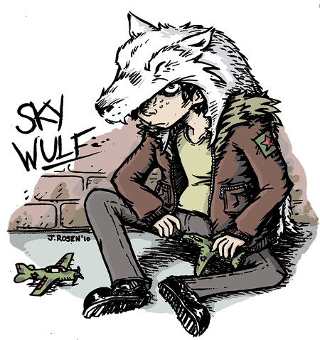
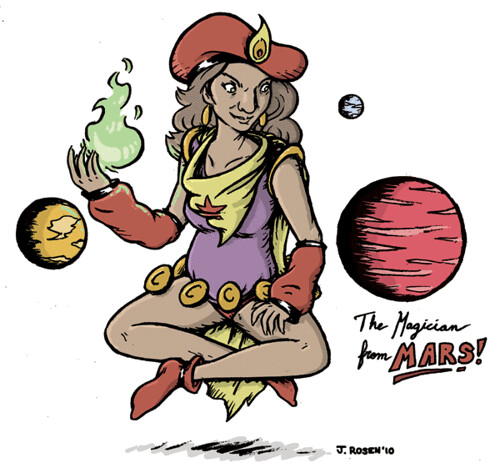
So I recently completed a series of illustrations for the upcoming issue of Panel to Panel magazine. The idea was to take Golden Age public domain superheroes and put your own spin on them, and all three of the ones I chose ended up being a total blast to draw.

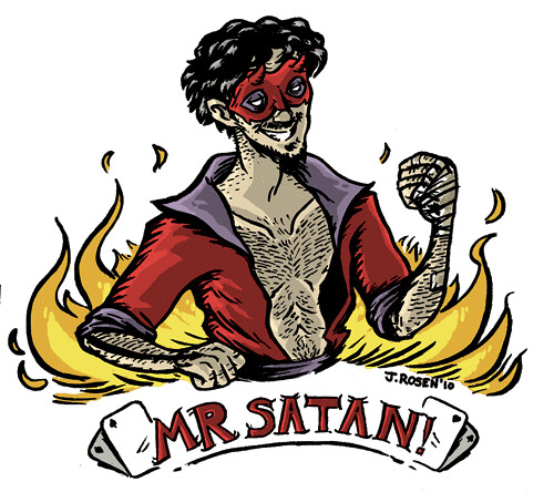
Mr Satan

This first one is Mr. Satan. What I liked about him is that despite his ridiculous name, he has absolutely no super powers. He's just a rich dude who one day decided to go out, buy a devil costume, and start beating people up, just because he was bored! What kind of person would do that?! I figured he clearly has a flare for the dramatic with a name like Mr. Satan, so I decided to model him a bit after a modern stage magician, sort of a David Blane type. His mask wouldn't obscure his face very much, because clearly showing off is part of the point. At the same time I wanted to give him a bare-knuckled brawler, roll-up your sleeves, devil-may-care sort of feel. This guy has no issues getting his hands dirty - in fact that's the entire point!

Skywolf

Next up is Skywolf. His is probably the most radical departure from the original of the three. Golden Age Skywolf was a World War II flying ace who for some reason felt the urge to wear a wolf pelt on his head when flying into battle. For some reason the first thing that came to my mind when thinking of people wearing animal pelts was the lost boys from Disney's Peter Pan, so my Skywolf ended up being largely based on that. This Skywolf is just a kid, and his "flying team" is a gang of homeless street youth that guard the city rooftops. I tried to keep the flying ace theme, however, through the oversized flight jacket and the toy planes. Figured there's no reason he can't still be obsessed with flying, even if he isn't a pilot anymore.

The Magician from Mars

Jane Gem, The Magician from Mars is the one where I stuck closest to the original design. I might have liked to depart further, especially with a premise as wacky as hers, but there was just so much to love about the original I couldn't resist! The hat clearly had to stay, as well as the cape and the puffy sleeves. My main goal became just to simplify and maybe add a bit more of a retro 80s feel. I could easily imagine her going out disco dancing or hanging out at the roller rink. I honestly came this close to giving her legwarmers too, but ultimately decided I didn't want to overdo it. (PS: if you want the full effect for this one, click to view larger)

The magazine isn't scheduled to come out 'till January, but in the meanwhile you can find out more about it through the Panel to Panel facebook page, and about Panel to Panel in general through their website. And if the wait for the magazine to be released is still incredibly unbearable, then you can pass the time by checking out some further public domain superhero drawings that my friend Bryan posted on his blog as well!

Sunday, October 31, 2010

Halloween!

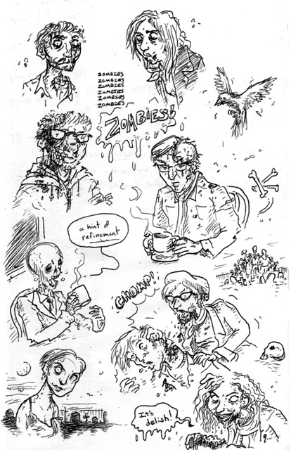
Oh my god you guys, it's my favourite holidayyyy. And, you know, Halloween so... zombies, right?

Zombie Sketches

I don't know what it is, but Halloween always fills me with such excitement. Something about the atmosphere, and people dressing up. And just everything looking so playfully sinister.

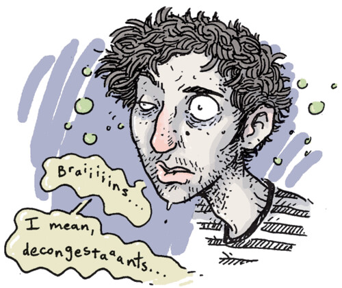
I had all these ambitions to make a big thing of it this year too. But then I got sick. So now I'm sitting around blowing my nose and watching a butt-load of horror movies instead. One may perhaps ask if this in some way diminishes the awesomeness of Halloween? If it causes Halloween to be somehow lesser? To which I reply: No. In no way whatsoever. You goddamn fool.

Josh Halloween 2010

Wednesday, October 27, 2010

Paw Prints

Hey all, sorry for not updating in a couple of weeks! I've been caught up with a couple of different projects this last little while, and its been keeping me pretty busy. But rather than sitting around and whining about not having anything to update about, I thought I'd make a quick post about one of these projects instead!

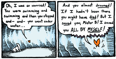
Paw Prints Sample 1

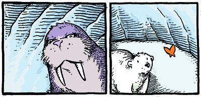
"Paw Prints" is a series of strips I'm currently producing for Dartmouth College's Project GreenLite campaign, encouraging students living in residence to develop healthier energy consumption habits. The strip focuses on a lone polar bear, separated from his home, traveling the Arctic and witnessing the direct consequences that global warming is having on the environment around him. I don't want to post any full strips until they're up online, but in the meanwhile I figured I'd post a couple of panels from two of the most recent ones. The bear actually goes through some pretty serious stuff as the story goes on. But you know, that's all part of the fun.

Paw Prints Sample 2

Also doing work for the project are two other CCS alumni, the incredibly talented Bryan Stone and Jason Week. They've posted a few samples from their strips on their respective blogs as well, so you should totally check those out too!

Thursday, October 7, 2010

Monstros and Grills

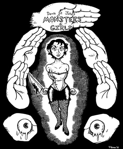
This is a pin-up I did for Denis St. John's recently released "Monsters and Girls: Amelia" volume 3.

Amelia

Click the image for a larger version. "Amelia" itself is such a weird mix of horror and humor and sexuality, and I tried to run with that as much as I could while making this. Playing with the sort of "cheesecake" aspect, while trying to keep it somewhat unsettling at the same time. It was actually really fun. And all of this was, of course, inspired by...


Okay, so I am a dude that really enjoys horror movies. Because of this, Denis St. John is one of my favorite cartoonists ever. He understands horror better than most of us probably ever will, with a knack not just for conveying the terrifying and the grotesque, but also for knowing how to make it fun. His comics are ridiculous, expressive, and over the top, and - most importantly - frickin' scary. And especially around this time of year, what more could you ask for? The third volume of his current comic just came out, and the first two are available to purchase through his website. You should give them a look! http://denisstjohn.blogspot.com/

Tuesday, October 5, 2010

Smoking is Bad

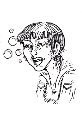
Just a quick warm-up drawing from earlier today, before getting down to inking some comics pages. It's a young hipster girl smoking, as they sometimes do.

Smoking Girl

Some days I love using brush so, so much.

Friday, October 1, 2010

In Other News...

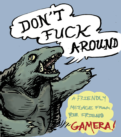
You know what I love? This guy...

Gamera


I think one of my all time favorite Gamera scenes is at the end of Gamera: Advent of Legion, after Gamera has defeated the evil alien threat and everything is safe again. Everyone's relieved, and the main characters are all walking and laughing and talking about how great Gamera is, when the main scientist lady is suddenly like: "Gamera's job is to protect the planet! And if humans continue to pollute the earth then Gamera will be very angry!" Then she just stares straight into the camera for an uncomfortable period of time. Then Gamera roars. Then the movie ends.

In other news, the White River Pirates comic I did awhile back is currently appearing in this week's Seven Days Magazine! The comic is a jam between me and my good friend Nick Patten, and was reformatted and colored by the amazingly talented Joseph Lambert. If you're in Vermont you should be able to pick it up anywhere that fun alternative weeklies are to be found, and if you're not then you can just read it online over here.

Wednesday, September 22, 2010

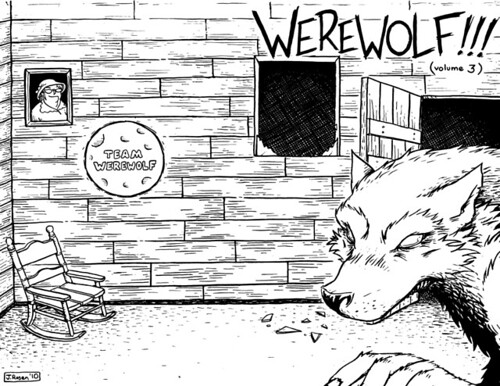
Werewolf!!! Cover

So as promised, here is the cover I did for Werewolf!!! volume three, coming out this weekend at MICE!

Werewolf 3 Cover Wrap-Around

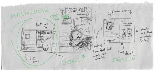
This particular cover was one of those fortunate examples of an illustration that more or less came to life fully formed. I knew I wanted to do a more detailed closeup of a werewolf, since the previous two covers had only featured werewolves at a distance or as a silhouette. This time, I wanted the cover to get in your FACE! I liked the idea of having this cover be an interior scene as well, since that was something we hadn't done yet. The whole concept just sort of flowed from there.

Werewolf 3 Cover Concept

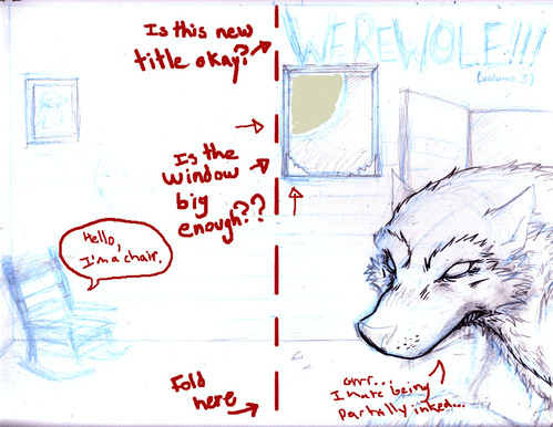
As you can see, I didn't change much of the original thumbnail concept once I moved on to pencils. If it works then why change it, right? Even from this stage of the pencils to the final inks, the only real additions were my decision to enlarge the window slightly and the smaller detail work on the walls and floor (though of course, the devil's in the detail ain't he? Or, you know, werewolf, as the case may be.)

Werewolf 3 Cover In-Progress

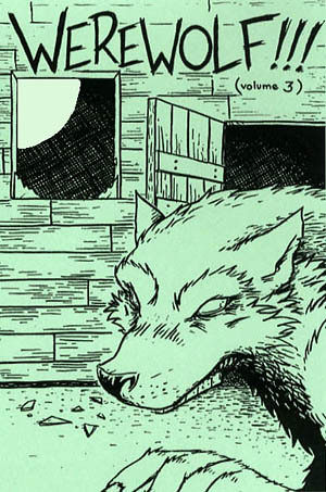
And voila, the finished design, as it will appear at MICE (complete with hand painted glow-in-the-dark moon!)

Werewolf 3 Cover Final

Of course if you aren't going to be in Boston this weekend, keep an eye on the Werewolf blog where we'll be posting info on how and where you can purchase copies of Werewolf!!! once MICE is over. And you know, while you're all busy clicking on links and stuff, you might also want to check out...


Penina is a lovely lady, and has probably been the main driving force in putting the latest issue of Werewolf!!! together. Her story "Cubs" is going to be one of the main features of the book, and it looks beautiful. You don't have to take my word for it though. You can get a sneak peek by looking at the preview pages she currently has posted on her blog: http://peninacomix.wordpress.com/

Friday, September 17, 2010

Werewolf!! Reviewed

Just a quick post! Turns out Rob Clough wrote a really nice review of the second volume of the Werewolf! anthology series over at The Comics Journal site! He makes special note of the cohesiveness of the book, which feels so validating considering how much emphasis we tried to put on that while putting the book together. He also had similar nice things to say about the first volume as you may recall, which puts us at two for two!

All of this is extra encouraging considering we are actually in the process of finishing putting together volume three! I've spent the bulk of the past few days finishing up my work on the cover, which I'll be posting more about early next week! Werewolf!!! (aka volume 3) will be premiering at the Massachusets Independent Comics Expo (aka MICE) at the end of the month. In the meanwhile, you can check out some sweet previews and links to places to order the first two volumes over at the new Werewolf Blog! Woo!

Tuesday, September 7, 2010

Hulk, Friend?

So woke up yesterday with this sudden urge to draw Jennifer Connelly as she appears in the 2003 "Hulk" movie. I can't really justify this. Have you seen that movie? It's extremely surreal, Jennifer Connelly's performance especially. She just straight up ignores the ridiculous premise, and horrible dialogue, and incredibly strange and inconsistent tone of the film, and does her best to invest you in Betty and Bruce's messed up relationship and the disturbed and overly-complicated family drama that surrounds it. Leading to scenes like this. She's acting so hard in it, like someone forgot to tell her that it was an Incredible Hulk movie. Watching it, you can't help but be like "Hey Jennifer, take it easy! Honestly, you can give it a rest! It's okay sometimes to just take your paycheck and go home..."

Connelly

You may have noticed the new banner I recently added to the site. You may also have noticed the extensive links section added to the side. I feel like I'm extremely lucky in that, partially through having attended CCS, but partially also just through luck and life, I happen to be friends with a lot of really awesome cartoonists. And while putting those links together, I decided that for the next little while I want to spend a part of every post I make highlighting some of those people.


First on my list is Laura Terry. She is from Texas, and her website claims she was raised by wolves and/or gypsies! She is also feisty and fiery and dangerous, and has a sense of style and design so finely honed it will cut you! She's currently posting a series of illustrations done during her recent trip to Kenya, which are really something to see. Check them out at her site: http://www.bravesailor.com/

Monday, August 30, 2010

Sketch Pages

Sketch Page

Sketch Page

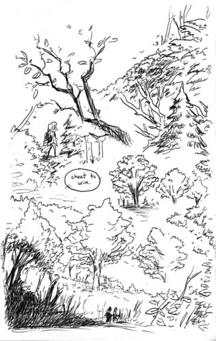
Some quick sketch pages that are actually from a couple months ago, of some trees and some random things. You can see these and a couple more pages over on my flickr. Also, I'm trying to think of what I should draw as a header for this blog, now that I think I'm going to start making it "official." Any suggestions?

Wednesday, August 25, 2010

New Blog!

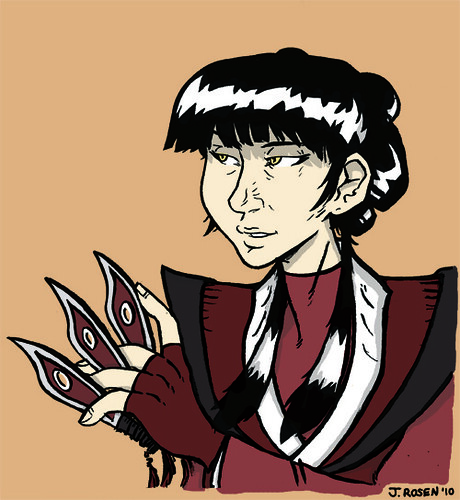
So I've started this blog with the intent of creating somewhere to post my art and comics online other than my livejournal. I'm not super familiar with blogger, at least so far, so it might be a bit until I really get into the groove of things. I'm positive and excited nonetheless though! And in celebration, here's a drawing of the character Mai from the tv show "Avatar: The Last Airbender" to get things started.

Mai

What is she looking at? Could it be... THE FUTURE?